
Release Notes
v5.0 — Latest
- NEW: Contingency tables + Chi-square / Fisher's exact — a new table type for count data; automatically runs Fisher's exact test (2×2, with odds ratio) or the Chi-square test.
- NEW: Volcano plot — a new graph available for Column, XY, Multiple Variables, Contingency, and Grouped tables, with adjustable thresholds, colors, auto-labeled top hits, and smooth rendering at 20,000+ points.
- NEW: "Rename group" on Grouped tables — renames an entire group at once from the header.
- NEW: Integrity check on open — flags broken .hlx files (bad references, unknown types) with a non-blocking warning.
- FIXED: .hlx file icon showing a question mark in Finder.
- FIXED: New columns ignoring table naming and skipping "P".
- FIXED: Grouped tables capped at 26 groups — now supports up to 200.
- FIXED: Crash on unrecognized graph type.
- FIXED: Tables going invisible after save.
- FIXED: Spurious Wilcoxon warnings on Grouped t tests.
- FIXED: NaN/Infinity now display blank instead of an error value.
- IMPROVED: Two-way ANOVA now uses Type III sums of squares.
- IMPROVED: Lower memory use and a faster sidebar.
- IMPROVED: Unified app background.
- IMPROVED: Table settings now open as a side panel instead of a dialog.
v4.0
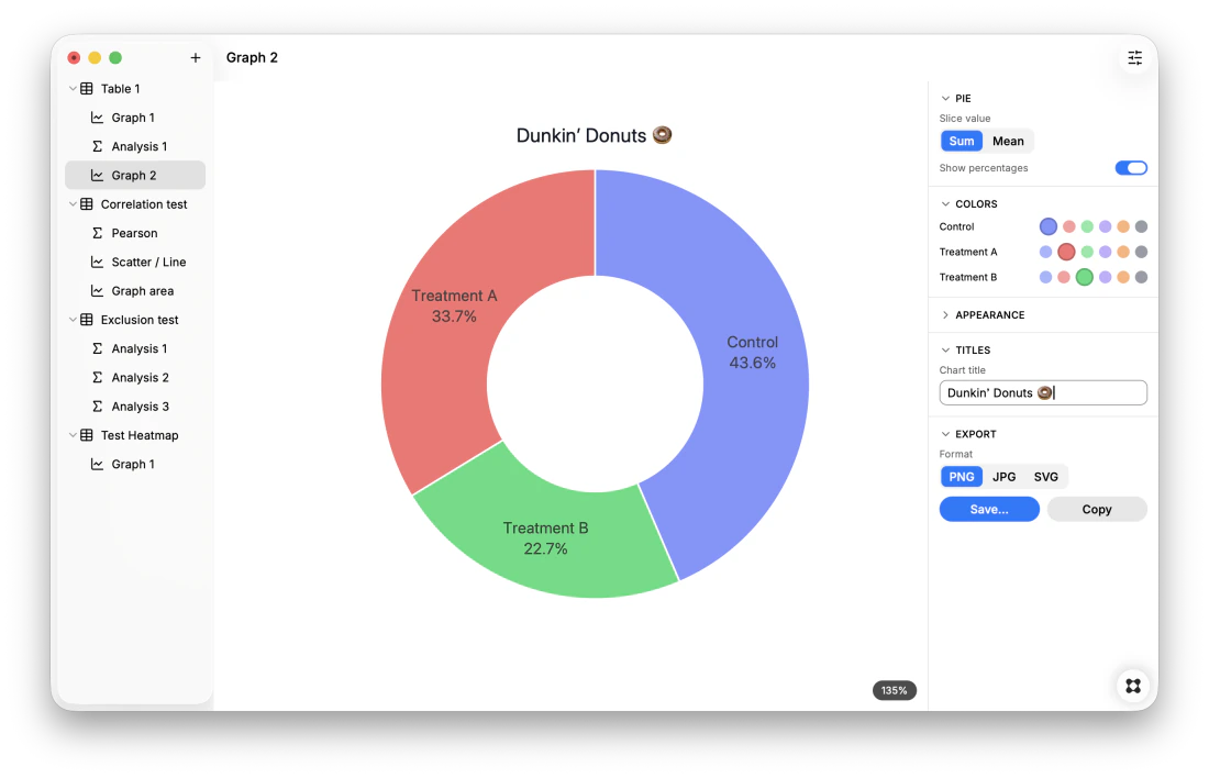
- NEW: Pie and Donut charts for Column tables — each column becomes a slice sized by its total or mean, with optional percentage labels.
- NEW: One-click Dose response curve for XY tables — fits a sigmoidal 4-parameter (4PL) model and shows the EC50 and Hill slope directly on the graph, with no separate analysis to set up.
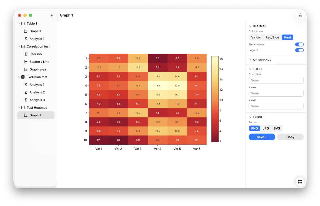
- NEW: Heatmap for Multiple Variables tables — color-codes every value across variables and subjects, with selectable color scales (Viridis / Red-Blue / Heat), optional value labels and a legend.
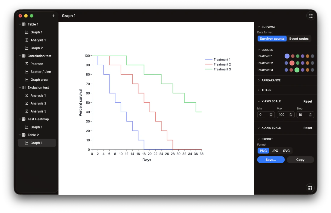
- NEW: Survival curve (Kaplan-Meier) for XY tables — step curve with censored-subject tick marks, supporting two data formats: one-row-per-subject event codes, or raw survivor counts per timepoint.
- NEW: Identify outliers (ROUT method) for Column tables — flags outliers column-by-column with a robust fit and false-discovery-rate control (adjustable Q), following the published Motulsky & Brown method, and lists exactly which rows to exclude.
- FIXED: Dose response curves silently failing to fit real data — the fit now keeps an X=0 control/vehicle point instead of rejecting the whole dataset, defaults to the raw-concentration model, and shows an inline message when a model genuinely can't fit the data.
- FIXED: Survival curves misreading "number still alive at each timepoint" data as event codes — a new Data format switch (Event codes / Survivor counts) makes both conventions plot correctly.
- FIXED: Dose response Model button labels being clipped in the side panel.
- IMPROVED: Clearer color selection — the chosen color is now a larger dot while the others shrink and dim, consistently in the graph's Colors panel and the spreadsheet's right-click Color menu.
v3.0
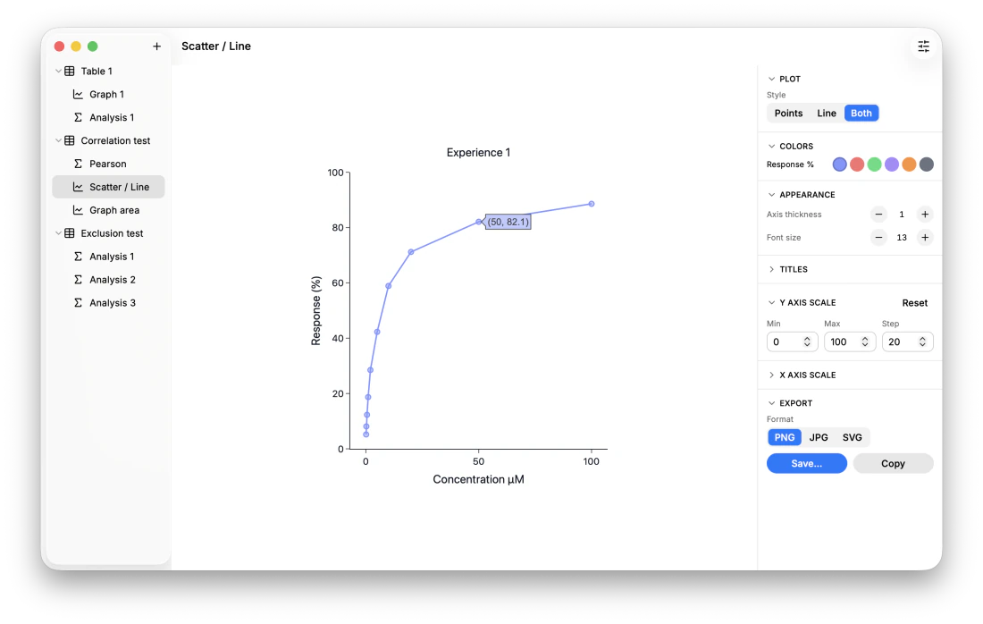
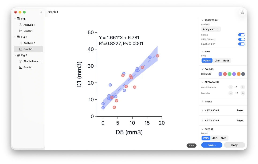
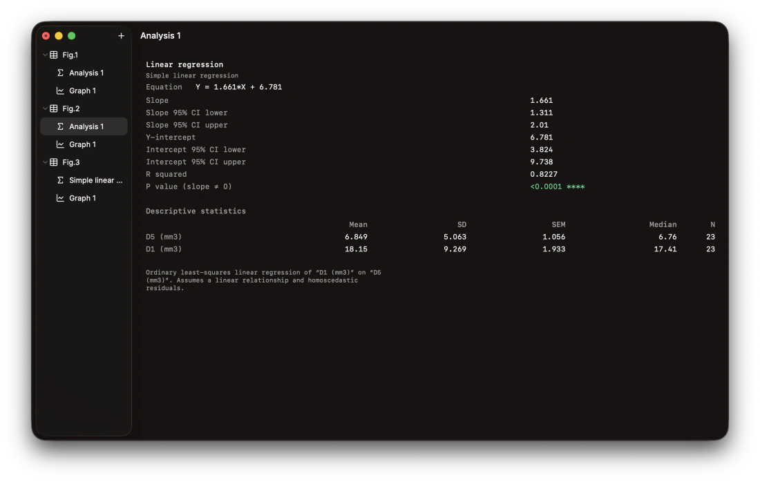
- NEW: Add a linear regression fit line with 95% confidence band and curve equation (Y = aX + b) directly on XY scatter graphs.
- NEW: Customize graph colors: set a color per data series from the graph's new Colors panel, and highlight individual points by coloring single cells directly from the spreadsheet's right-click menu.
- FIXED: The linear/nonlinear regression wizard incorrectly listing the renamed X column as a Y-data-set choice (it matched X by its default name instead of its position, so renaming X broke the exclusion).
- IMPROVED: Live size readout while resizing: dragging a graph's X/Y axis now shows the current width × height (px) in a small pill that fades out when you stop — handy for matching one graph's size to another.
- IMPROVED: Softer graph fills (50% opacity) so fill and outline read distinctly.
- IMPROVED: New app icon.
v2.0
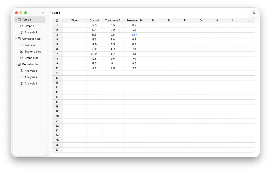
- NEW: Exclude data from analyses and graphs — select cells, rows, or columns and press ⌘E (or right-click, or Edit ▸ Exclude / Include). Excluded values stay in your table but are dropped from every stat and graph.
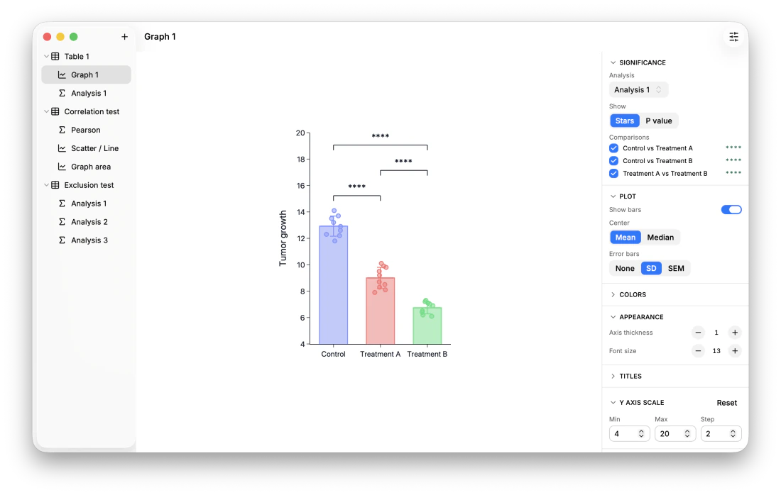
- NEW: "Appearance" section in the graph Format panel, with two minimalist native −/+ steppers for axis thickness and font size.
- NEW: Each section title in the graph Format panel is now a clickable header that collapses or expands its section.
- FIXED: The "Plot" section no longer shows up empty for XY graphs.
- FIXED: The X and Y axis Min/Max fields now snap their auto defaults outward to clean whole numbers.
- FIXED: Long X-axis labels no longer disappear or block you from shrinking a graph.
v1.0
- Initial Release: Core scientific spreadsheet, R statistical testing via WebR, Plotly graphing, and native .hlx project format.